|
Forums >
General Industry >
Your portfolio's most underappreciated image
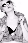
TooCoolQueeniee wrote: Thanks luv!!! Dec 03 06 01:17 pm Link TooCoolQueeniee wrote: ? Dec 03 06 01:18 pm Link There was a different picture there before lol Dec 03 06 01:20 pm Link Eloisa Katie wrote: Nice picture of you but you get lost in the picture. Not sure if different lighting or just being a bit further from the window would help. I'd probably use a larger aperture to leave the background out of focus a bit or blur the background a touch. Dec 03 06 01:23 pm Link TooCoolQueeniee wrote: oh yeah LOLOLOL I had to edit that...it wasn't me! I might as well be blonde today huh? lol Dec 03 06 01:24 pm Link Eric5312 wrote: that hit it on the head! Beautiful models but the background takes away...too busy...or beautiful model? is that the same model twice? Dec 03 06 01:25 pm Link  Dec 03 06 01:26 pm Link Jay Bowman wrote:
Dec 03 06 01:26 pm Link What Fun Productions wrote: ;-) Dec 03 06 01:30 pm Link I don't know how to post links but I'd say the one of me on the porch of the yellow house. Dec 03 06 01:30 pm Link TooCoolQueeniee wrote: I see why it one picture of the day. It's an inspired shot. Would centering it to the right more help? That way the slope of the chain and the back of the female model would be leading into the picture rather than out of it. Dec 03 06 01:31 pm Link Olof Wessels wrote: Personally, I think it's a great shot! Dec 03 06 01:34 pm Link Yumemiru wrote: I think it would be stronger without the feather head piece. Dec 03 06 01:34 pm Link MsJuwels wrote: Don't think its a very flattering picture of you. I looked at your port. You're beautiful, its just this picture. Dec 03 06 01:37 pm Link Eric5312 wrote: Thanks, I choose them off center as you can tell they are swinging and in the moment. I do appreciate the feedback though Dec 03 06 01:40 pm Link Eric5312 wrote: I agree after seeing the rest of her port, I personally wouldn't have it up, not a good picture of you compared to the rest. Dec 03 06 01:42 pm Link TooCoolQueeniee wrote: Great capture but add a gradient to your blur layer if you want the DOF effect to look natural. Dec 03 06 01:43 pm Link Eric5312 wrote: cool, thanks so much!! I needed to hear that =0) an honest set of artist's eyes are very appreciated. Dec 03 06 01:44 pm Link MsChris wrote: Here: Dec 03 06 01:44 pm Link btw, I think its just the wrong angle for you. btw2, if you ever get down to Champaign I'd love to work with you, as model and as MUA. Dec 03 06 01:48 pm Link BlindMike wrote: Hadn't thought of that myself for my pictures. Thanks. Dec 03 06 01:50 pm Link BlindMike wrote: thanks a bunch:) Dec 03 06 01:51 pm Link Here is mine. Its kinda new so i guess thats all for now. https://www.modelmayhem.com/pic.php?pid=1799115 Dec 03 06 01:56 pm Link MsJuwels wrote: cropping sucks Dec 03 06 02:03 pm Link Photography By Amaru wrote: Need more contrast and maybe a bit more sharpening. That could be just the transfer to the web and not what the original looks like. Dec 03 06 02:10 pm Link ravens laughter wrote: SO BLUNLTY HONEST LOL I APPRECIATE IT ...THANKS!!! Dec 03 06 02:13 pm Link I always thougth this was a freindly looking guy...  Dec 03 06 02:20 pm Link XtremeArtists wrote: Thanks for getting my pic up. Now, on to yours. After a full review of your MM port pics, I consider this my favorite in terms of subject matter and the expression of the model. I love the lighting, the way it fits her (portraid) mood. Dec 03 06 02:24 pm Link Dec 03 06 02:30 pm Link MsJuwels wrote: well I'm sorry, but you are a beautiful woman.... and when i see cropping like that it just makes me cringe.... Dec 03 06 02:37 pm Link irvwilson wrote: "I'm Herb Shibley, and I can paint that house for nine ninety five." (or something like) Dec 03 06 02:38 pm Link ravens laughter wrote: don't be sorry!! I appreciate the fact that I can get some honesty lol you opened my eyes to something I failed to pay any attention to. Now I gotta find some FIRE to replace it =0) xoxoxoxo Dec 03 06 02:42 pm Link Eric5312 wrote: LOL I love the shot too! It's fun =0) Dec 03 06 02:42 pm Link markcomp wrote: Nice shot. Highlights at bottom a bit blown out but who am I to criticize. All of your work blows away mine. Dec 03 06 02:47 pm Link Dec 03 06 03:03 pm Link Eric5312 wrote: Thanks, I think you have quite a few nice shots. Dec 03 06 03:38 pm Link jade83 wrote: I've looked at your port before and like it. This one though is one of my least favorite. Interesting concept. A couple of things come to mind. The lower part of your dress needs to be tapered in. Doesn't show and any of your figure and the greek-goddess-sculpture look needs that. I'd go at least half way down your legs too. Ideally you would do it with a toga type outfit. Dec 03 06 04:18 pm Link This is the least popular image in my portfolio. I think it's very different and sexy. I'm curious why it doesn't appeal to people as much as the other images seem to.  Dec 03 06 04:30 pm Link Audrey wrote: I think what bothers me about this one is that with the red light on you it has this aura of "red light district" which obviously is not something that matches your personality or who you are. obviously you aren't dressed to be in the red light district but that is the feel that the light gives me. Dec 03 06 04:34 pm Link Without a doubt .. this one!  It is on this page; https://www.modelmayhem.com/pic.php?pid=17602 The reason? Look how high she is jumping! That is wet cement under Natalie, and she is a professional soccer player from Germany. I asked her to jump, but I had no idea she would give it that much height! After that, I was scared that she would land wrong and injure herself, so I said "we got it! I'd rather be safe than sorry! BTW, ... it's a film shot. Anyone else want to try jumping for me? I promise it wont be on wet cement! Dec 03 06 04:36 pm Link |

 Thanks anyway LoL