|
Forums >
General Industry >
Your portfolio's most underappreciated image
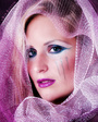
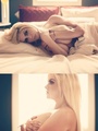
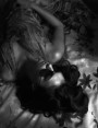
This was one of my favorite pictures but I took it down becasue of lack of interest:  Dec 07 06 07:07 pm Link Hmmm...  Dec 07 06 07:20 pm Link my least favorite photo in my port is  but i lubsss the curls, it reminds me of an ad Hair by Nedjetti and Trevasia, I love that photo of you, the outfit is LOVELY !! Dec 07 06 08:20 pm Link Hair by Nedjetti wrote: Thank you!! I guess we're among the few that appreciate it lol.. Dec 07 06 09:16 pm Link Roustan wrote: Thanks for the critique. The upper left has bugged me too. I have needed to go back and redo it. I think are right about it too soft to stand out amd thus gets lost. I like your idea of the border. Thought it would be too much when I did it but now I think like you said a very thin border might help. I'll give it a try. Dec 08 06 06:47 am Link Michael Kirst wrote: OK, looks like I am back in the art critique business. First, my usual disclaimer: I'm still learning; take what I say with a grain (or two) of salt. In your case, you are way ahead of me (I looked at your port--great) but I can't stand to see any picture go unmolested. Actually seems kind of lonely in a way not to get a comment on a picture you have gone to the trouble to post. Dec 08 06 07:05 am Link crazybaby wrote: You have such a strong port that this one gets lost. I don't think the cropping helps but its just not got the interest the rest of your pictures have. Dec 08 06 07:13 am Link Miss Kelly T wrote: I don't know either but just not that exciting. Might help if your head was turned a bit more to the camera. Even though you are looking toward the camera you don't seem to make eye contact. It also looks like the standard photo studio shot (and that is really the pot calling the kettle black-feel free to make disparaging comments about my port). While I am being overly critical I also don't think the light showing on the left side helps. It actually detracts attention from you. If the picture were wider with you to the far right the light idea might work by pointing attention toward you. Having said all of that you could model for me anyday. Dec 08 06 07:21 am Link Dec 08 06 07:27 am Link OOps...my bad...here's the proper link! https://modelmayhem.com/pic.php?pid=1640098 sorry I'm new to the site and havn't figured out quite how to paste pics here yet!! Dec 08 06 07:29 am Link Leah Rogers wrote: I'm going out on a limb on this one because I'm not sure how qualified I am to comment on this. I like the picture overall and I think you (the model) have done a great job. From the photography standpoint though I think the lighting is too harsh, particularly along your neck and chest. I like this style lighting in b&w but in color it just doesn't do it for me. Don't know it that helps. Dec 08 06 09:18 am Link Natasha O wrote: Left portion of the picture is good and the right lighting for the mood. The harsh lighting and glare from the right doesn't go with the image. Kills the shot. Looked at your port and you also have a somewhat similar picture next to it. Dec 08 06 09:22 am Link double post Dec 08 06 09:23 am Link  Doesn't any1 love Kizzy! Dec 08 06 09:23 am Link RED Photographic wrote: I suspect artistic pictures of nude males don't get commented on as much. I know I am guilty of that but I think this is the best of your portfolio. Not just because its probably the least suggestive. I think this one really shows some talent rather than just showing a good body. Well done. Dec 08 06 09:31 am Link My avatar. It took a lot of time and pain to get that shot. Dec 08 06 09:33 am Link Aesthete Studios wrote: I'm taking this out of order but it just popped up and I have to take off. Dec 08 06 09:35 am Link BlackWatch wrote: Hi BW, You know I like your work but not crazy about this one. I think the other version in your port is better. It's the green hair in this one. The color clashes with the rest of the picture and the selection on the hair doesn't look real (maybe needs to be feathered more). Anyway, stick with the other version. Dec 08 06 03:24 pm Link Trevasia wrote: I like this one but you have some real eye-catchers before it so I think it suffers by comparison. Dec 08 06 03:27 pm Link ok,,I'll do this later. I am not linking or loading my image correctly. ::sigh:: ak Dec 08 06 03:33 pm Link Jay Bowman wrote: Jay, image #1 is MUCH MUCH MUCH better than image #2, regardless of what the peanut gallery here says. Dec 08 06 03:37 pm Link Eric5312 wrote: That's cool, this pic is one of my favorites. Thomas outdid himself considering the fact that it was at least 105 degrees, all of my makeup had sweated off, and I was probably being a little bit whiney from not having any sleep the night before! Dec 08 06 03:52 pm Link Renee_JK wrote: Go to FAQs for help on posting pics. I'd post this one for you but it is 18+ so you can only put up the link anyway. Dec 08 06 05:31 pm Link Miranduuuhh wrote: I like this one a lot. From the model's standpoint I'd say it is great. From a photographer's standpoint I'd cut down on the contrast some. I see why you like it as your avatar. Works well. Dec 08 06 05:36 pm Link |