|
Forums >
General Industry >
Your portfolio's most underappreciated image
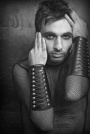
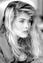
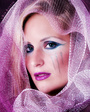
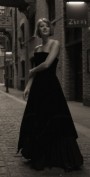
I like this series but not many else do. only took 12 images (film) and got a few good ones IMO.  Dec 05 06 09:31 pm Link opps dup. Dec 05 06 09:34 pm Link LightLab Studios wrote: I love this image - but it has some tough competition in your portfolio! Dec 05 06 09:46 pm Link Dec 05 06 09:49 pm Link Sarah Ellis wrote: That image is incredible. I had to comment. Dec 05 06 09:51 pm Link It's a tie between these 2....   Dec 05 06 10:00 pm Link Tie between the 2 above images Dec 05 06 10:00 pm Link So under unappreciated I removed it from my portfolio.  Dec 05 06 10:05 pm Link Ransom J wrote: Thanks Ransom! It's so nice to get positive feedback from someone I respect Dec 05 06 10:06 pm Link San Pedro Photo wrote: I think this is a lovely image, but your copywrite really detracts from it. Would it be possible to make the copywrite smaller or fade it out a bit? Dec 05 06 10:08 pm Link Sarah Ellis wrote: Check my MM portfolio page and you will see that the logo is super small on the new pics. I use and automated feature in Aperature and it took a little fine tuning. I've had some photos stolen over the internet before. Thanks for appreciating my photo. It is one of my personal favs. Dec 05 06 10:25 pm Link Here is my least popular pic. I've gotten some feedback from it on another thread, but I still would like a more unanimous opinion. I think it isn't so great because the color is distracting. Would you all agree? Also, there was a lot of photoshopping in this image (background/soft glow). Do you think it is overphotoshopped? Any thoughts would be greatly appreciated. And go ahead and be brutal.  Dec 05 06 11:12 pm Link Aesthete Studios wrote: Well, standing alone, I think this photo is really strong. But when I look at it within your portfolio, it doesn't stick out too much. I think it's the color. The green REALLY pops, and in a great way, but the bluish black tends to fall back and neutralize the image a lot. If she had some other color outfit, like yellow for example, it would probably get a lot more attention. May not make it a better photo, but it would probably get more hits. Dec 05 06 11:23 pm Link I just came across this thread and then went to my portfolio here on MM and picked out the pic that has the least views and the only one to have no comments. Here it is for your viewing pleasure:  I don't know that it's necessarily the "most underappreciated" as much as just not a fave among my peers. It's got kinda a Weber feel to it I think. I like it ok. But then, I'm a fan of all my work... MK  Dec 05 06 11:35 pm Link HungryEye wrote: Reminds me of Helmut Newton which I imagine you intended. Dec 06 06 06:33 am Link  My least commented on pic Dec 06 06 06:41 am Link DreamAwakening wrote: Nice but might have been stronger if more of the model showed. Maybe just down to waist level. Nicely done though. I'll add my usual disclaimer, "Take this with a pound or two of salt." Dec 06 06 06:51 am Link then take it out of your port....lol Dec 06 06 06:57 am Link For my photography port: https://www.modelmayhem.com/pic.php?pid=1811100 (my avatar) for my modeling port: https://www.modelmayhem.com/pic.php?pid=1292210 (18+) Dec 06 06 06:57 am Link Ransom J wrote: Boy, I agree. What did you coat your body with? Watered down plaster? It's a great effect. Dec 06 06 07:00 am Link Benny wrote: Wierd but it works. Great use of negative space. Dec 06 06 07:05 am Link Leo 3 wrote: Both of these are very powerful shots. The first is my favorite but the second is a close second. Dec 06 06 07:07 am Link   Dec 06 06 07:09 am Link Roustan wrote: OK, despite a comment that someone would rather have comments from a photographer they respect (of course so would I) , I'll comment since no one else has. Overall I like the picture. From a photographic standpoint I'd say the angle makes her butt look too big and her head too small but since this is fantasy maybe that's ok. Still I find it a bit distracting. From a PS standpoint I would first bump up the contrast and then may or may not need to sharpen a bit. If that didn't do it I'd go back and try to soften the color of the background and then adjust contrast as needed. Dec 06 06 04:02 pm Link  Dec 06 06 04:10 pm Link Dec 06 06 06:12 pm Link adelinet wrote: Other than your face being a bit out of focus it looks pretty good to me. I'm surprised no one else has commented on it. When I'm in London next year I'd love to work with you. Dec 06 06 07:43 pm Link Aardwolf Studios wrote: It's just too stark for me. I was hoping someone else would comment because I suspect there are others who would really like it. My favorite in your port is the wood nymph. Dec 06 06 07:49 pm Link i don't know why..  Dec 06 06 07:54 pm Link You posted the link to this one. Looked at your port and I think this is actually your best. Really captured the moment. Great intesity of effort in his face.  Dec 07 06 05:43 am Link I've taken a lot of pot shots. How about someone else taking a turn. Try this one. One of my favorites that gets ignored.  Dec 07 06 05:52 am Link Eric5312 wrote: LOL, I love it but people have told me they find in unnerving. Sometimes I think that's a good thing. Dec 07 06 02:25 pm Link heres mine, it's new, but only has 2 views and I love it, I kind of wanted to see what other people thought.  Dec 07 06 06:05 pm Link Eric5312 wrote: Thanks for your insights. I think they would definitely help the final look of the photo. Dec 07 06 06:27 pm Link Eric5312 wrote: I don't think this is a weak photo at all. However, i think, like some of the others here, when it is grouped with other photos that exist in your portfolio, it doesn't stand out. Dec 07 06 06:37 pm Link Heres mine, well I have a few, but this is my fav and has a comment  Dec 07 06 06:41 pm Link Okay, I'll play.  For me, it's this image: For me, it's this image:  It's called "Touch of Autumn" & I worked my A-double-scribble off on it! lol. I do tend to notice, though, that landscape-format images don't get nearly as much attention on MM as the portrait or vertical format images. They even show up smaller in the page display. I often think that's why this poor painting got the shaft, so to speak. I have another shot very similar that was taken vertically & I am going to perform an experiment & paint that one up & post it. It will be interesting to see if it gets more attention or not.  Dec 07 06 06:47 pm Link Wandering Bohemian wrote: WOW thats cool. I really adore this image Dec 07 06 06:52 pm Link Awww, thanks Natasha! Yay! I'm feelin the art-love. hee-heeDec 07 06 06:58 pm Link Black and white, not 18+, no chance...  Dec 07 06 07:00 pm Link |