|
Forums >
Digital Art and Retouching >
Gucci Earth/Jewel Toned Campaign Image
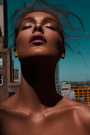
I'm usually pretty good at toning, but I've tried to recreate this look and I've mostly failed. I know it's desaturated and has lots of greens and cyans, and there are probably some textured overlays, but I’ve been fiddling with blend-if, apply-image, selective color, and even some LAB… and nothing seems to work. Any thoughts?  Oct 08 17 02:49 am Link PitchBlack wrote: I don't see any textured overlays, just lost of compression artifacts. Also this is not a desaturated look. If you look at a vectorscope for the image you will see that it is actually oversaturated (clipped) in certain zones of the color space: Oct 08 17 03:54 am Link Interesting. Though I'm still not sure how I might get there. Oct 08 17 05:23 am Link Hi Pitchblack In a similar topic discussed the Gucci color correction and other similar post productions. It's not an easy job. I work with numerous techniques to get that type of picture. Selective color correction, match color, color grading and other way to have a good process. But each image has a similar processing and not always the same. I think you work with the right technique as you wrote. Not other way. I took a sample image and recreated the shades of the Gucci image that you linked. The important thing is to have tones in harmony, even when the colors seem not to fit well. Gucci's pictures are prepared before shooting and then post production. Editing an image, with colors not suitable for tones like Gucci, is much more complicated. Bye  Oct 08 17 06:48 am Link fireshoot wrote: Nicely done. Thanks. Oct 08 17 07:49 am Link PitchBlack wrote: I believe you can get there in Lightroom or ACR alone. Oct 08 17 08:05 am Link This is the same image, but using complementary colors. This is one way from Gucci images. It was better if the clothing had already matched colors.  Oct 08 17 08:56 am Link so i am not sure what methods you have actually tried but if you want to achieve these colours you need to mask out each element and make it the colour of the inspiration, also the light needs to be similar in the photo, even though this image isnt the same or shot similarly it can still work if you manipulate it enough  Oct 08 17 09:29 am Link They are also impeccable because they are just to give a perceptual idea of Gucci style work. With high resolution images you have to work with great accuracy and perfect selection masks. Especially if it is a job and not an amateur image. Oct 08 17 12:28 pm Link fireshoot wrote: Some shared observations (Please don't take any of this as a critique): PJKRetouching wrote: As you can see above and below this is a wrong approach. Oct 08 17 02:45 pm Link The greater saturation you see is because I have embedded a color profile to save, but the postimage server will probably have changed profile with sRgb or without tags. I do not know. I explained that the editing was performed on a low resolution screenhoot and so it is clear that there are blunders defects, unable to properly display the contours of the image. My image was also less than that of the other user. The techniques I use are "even" those that perform brushing the color in soft light, multiply, color mode, and use color masking masks to match clothes or skin. It's a known technique is not new. Use selective color and grading color is much easier on images that are already being shot at. "recoloring" images that have nothing to do with Gucci shots is very different. In these cases, everything has to be restored. It is not the technique to be wrong, but perhaps to show it on unsuitable files and also to a non-optimal resolution. But as mentioned above, it was only for demonstrative purposes. Very accurate work takes time. It was not the purpose of showing a perfect editing, but just explaining in summary, the technique for obtaining these images. Oct 08 17 04:07 pm Link fireshoot wrote: Of course, it was quick and dirty just to explain generally. We are not clients. Oct 08 17 04:14 pm Link It'so. For a paid job, you can also work 24 hours on an image to process. The same techniques used in 5 minutes in surface mode can be used in 5 hours. For a quick explanation, it is enough. If you want to do a 2 hour tutorial, you need to have time to dedicate yourself. In a forum is possible do this. But need time to spent. Is not always possible. We are not clients.
Oct 08 17 04:29 pm Link If one uses paint masks this means the pre-processing is totally wrong (which normally means the image does not need post-processing but deleting). A fashion image like that of Gucci is aimed to sell a product. It must create the impression and the mood of the original colors of the product, so if there is any color grading it is usually meant to match the environment to the palette of the product or to create contrast between the original color and the environment. The intent is not to create some total fake with illusory colors because when the customer sees a blue sweater and goes to the shop and sees a yellow one she will simply move on. So first comes seeing and understanding the whole thing, then photography, then retouching. Not merely playing with tools. okay you need to step back for a second, the image was just a sample that everyone here was using so I said that if you want to achieve the same look as in this Gucci image you will need to use the same colours and tones, its logic, and obviously Gucci shot their images with the colours, moods and locations that was most fitting, I am fully aware that this Gucci image has not been as colourised as what I did because they are shot differently and are not even slightly alike. Oct 08 17 07:59 pm Link
Post hidden on Oct 09, 2017 12:57 pm
Reason: other Comments: Unsolicited critiques are not permitted. Oct 08 17 11:40 pm Link Ok Pitckblack....I hope I have been a little useful. If you have any questions about some post-production technique, about this topic too, we will try to argue it. See next time. Bye.  Oct 09 17 01:32 pm Link PJKRetouching wrote: I looked at your work on your website and when it comes to hair for beauty your work is marvelous. Oct 09 17 08:42 pm Link You guys talk too much and I don't have the time for this. So to keep it as short as possible: When it comes to learning: I don't see any reason to make a practical demonstration of something, then confirm (verbally, theoretically) that it is not how things are done, then put a lot of words to justify that the wrong thing is right. It is just meaningless. PJKRetouching wrote: That's because you take an excerpt. You have to read carefully and understand what was said as a whole. If you split what was said word by word or letter by letter - it will never make sense. and as for paint masks, I can tell you have never worked on a campaign image before because you wouldnt say that otherwise Not that this is on topic but just for info of your highness: I have been managing a studio for video and print advertisement since 2002. So your crystal ball may be broken. I don't see why you are talking about compressing jpg's and loss of detail? Again - you don't see because you don't look. I have never even mentioned the word "detail". Oct 10 17 07:13 am Link anchev wrote: you don't have the time for this yet you wrote the biggest and longest post in this thread.. hmmm anchev wrote: This sentence is pointless, like most of your sentences were, but when it comes to learning, the best thing to do is show, tell, example something as much as possible, it will help them to read it, see it, and take it in.. it's basic understanding. it was just an example photo, we do not have the photo that the poster wants to change, and all they asked was to make their own image look like the gucci image, they didn't ask how to shoot and set up one, they already have the image! so it's me just answering their question. anchev wrote: I am reading it as it is, and you are going off topic anchev wrote: Managing a studio for 15 years and still no Elle, Vouge, L'officiel, Harpers Baazar, L'officiel or any high-end publication?... hmm interesting Oct 10 17 07:45 am Link PJKRetouching wrote: I don't see anyone asking you about me or my work. Oct 10 17 01:17 pm Link anchev wrote: My point is that you have no creditability to say or tell me that masking elements in an image is wrong when I know it's not, because I have experience in working on images that get published in high end magazine and as campaigns, and paint masks are used. Oct 10 17 01:27 pm Link PJKRetouching wrote: Your really must learn to read more carefully. As you can see above and below this is a wrong approach. and it is completely factual and valid because the example sucks big time, even for a non-professional eye. This is a fact, not an opinion, not a personal remark. I also explained why providing bad examples accompanied excuses about time and so on is meaningless. Superficial learning is not learning, just like superficial reading is not reading. If one uses paint masks this means the pre-processing is totally wrong (which normally means the image does not need post-processing but deleting). and it is also a fact. Changing color completely by painting it in post means that the color was not chosen very wrongly in pre-production (e.g. a blue shirt instead of a red one). But even if such significant color change is justified for some peculiar reason there are methods to change it without masks, more accurately and efficiently, without spending 24 (or 2) hours. This is also a fact, I use it in my work all the time, there have been earlier threads about this in which I showed some examples. In case you are interested about it read the article "Retouching with LUTs" on MM edu. It's what you usually asked to do when working on high end publication images and campaign images, mostly for depth and to avoid colour contamination, it's not up for debate, it's what happens - something you don't have experience in from what I can tell - and I don't need a crystal ball to see that Your urge to tell that you know and that you are superior because you have some list of names is quite obvious. That doesn't need clarification and I can read quite well your sneering "hmm"s. I have been trying to avoid this discussion but you keep pushing and pushing. Let me tell you something about campaigns, most kindly and respectfully: Oct 10 17 03:56 pm Link Here is a fresh video illustrating very well why Photoshop's masks are inefficient when it comes to color grading, so I thought it may be useful for everyone to see it: https://www.youtube.com/watch?v=ueMb99gnSSQ It is in Russian but usually within a few days the videos are also translated in English on the YouTube channel. Oct 11 17 03:00 am Link |