|
Forums >
Digital Art and Retouching >
How to achieve this tone ?
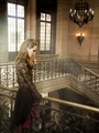
Hello, Do you guys know how to achieve this tone ? Do you think is just by using Gradient Map with blend mode ? Or Hue/Saturation with colorize ? https://drive.google.com/open?id=0B4OyS … nplTzdhZVE I'm having a hard time trying to get that toning correctly but it wasn't so good. Thank you for your help. Mar 20 17 08:14 am Link Bertrand Noel wrote: As in many similar threads - it matters where you start from. If you show your input image, someone may be able to help. Alternately you may try to reverse engineer the toning by degrading the image, making it as close as possible to your photo and then invert the process. Watch the neutrals, the skin tones (things you have some idea about) and work from there. Mar 20 17 08:57 am Link Bertrand Noel wrote: Bertrand it appears you are on the right track with this enchanting image in your book... Mar 20 17 11:33 am Link Thomas Van Dyke wrote: Thomas, there is nothing to rethink. I would appreciate if you don't speak on my behalf and post unsolicited personal conclusions directly or indirectly. Not because I am concerned but because it is off-topic. I don't feel I have abused anyone, so please - you don't need to excuse me. Mar 20 17 01:18 pm Link Thomas Van Dyke wrote: Thank you Thomas for your help ! Mar 22 17 12:43 am Link anchev wrote: Anchev, I understand what you say about the interpretation of an image and I totally agree. I edit my images for years and I know it takes experience and work. Mar 22 17 12:58 am Link I find it useful to break down the process into stages. First establish the tonal values/relationships/contrast. This can often best be achieved by viewing the image in greyscale. The next stage is often to deal with the saturation balance across the image and locally. Once you have tonal values and saturation under control you can focus on the hues. At this stage there are many options globally and locally. Constraining global adjustments at this stage by using the Hue Blend Mode can be helpful. More often than not, global adjustments are backed off significantly by reducing the opacity of the adjustment layers, and the final overall look may be achieved by using a number of adjustment layers - Colour Balance, Selective Colour, Gradient Mapping etc, etc. Then you might move on to texture and grain ( I find it best to float this layer on top, so you can deal with image sharpening later without sharpening the actual grain). And finally deal with local contrast and image sharpness. The above approach is just a broad suggestion - in reality, you tend to move back and forth, making interactive adjustments as the work progresses. But the main thing is to have a clear idea of how each of the individual elements (tone, saturation, hue, texture, sharpness etc) contribute to the whole picture, and to be able to identify and manipulate them separately and systematically. Mar 22 17 04:12 am Link Bertrand Noel wrote: Well, that comes down to the same 1-3 which I mentioned. Homogeneous means uniformity, which means no/little difference, i.e. reduce variation/contrast. So if that is what you want you can approach it in different ways. Mar 23 17 04:28 am Link a k mac, Anchev, Thank you for your time. It seems easier to separate colors and luminosity. Thanks for the file Anchev, it's finally very simple and corresponds to what I already do on some of my images. I probably overestimated the colorimetric retouching on this image. The rendering is very beautiful (perhaps also because the composition and the image in general are very good in my opinion) and I had the feeling that this was a more complex adjustment. I forgot to quote the name of the photographer, Clara Giaminardi : http://www.claragiaminardi.com/editoria … RLAND-SS17 Mar 23 17 08:27 am Link Anchev, would you mind telling me what a degrade is? Are you trying to neutralise the image e.g. correct the white/grey/black point & reduce contrast to find out the starting point? I dowloaded your curves but when I tried to match them using the white/grey/black eyedropper from a Curves layer and it did not match- it kept the image still quite yellow whereas your image is quite blue in the walls. So I am presuming you did this visually? I'd like to learn this technique. Thanks! anchev wrote: May 03 17 03:46 am Link SW Retouch wrote: Yes. I dowloaded your curves but when I tried to match them using the white/grey/black eyedropper from a Curves layer and it did not match- it kept the image still quite yellow whereas your image is quite blue in the walls. The curves preset I shared is for this specific image and only for it. So if you are trying with a different image or if you have changed color space expect different results. Also note there are 2 layers in different modes. So I am presuming you did this visually? I don't remember (it's an old thread) but I don't use eyedropper tools in general. Usually to find a curve that neutralizes a particular tone you can create a color sample over it, set it to display LAB values and fine tune your RGB curves until the a/b values for the sample become 0. To preserve luminosity set the layer mode to Color first. May 03 17 04:08 am Link Hi Anchev, Thanks so much for your reply. I learnt a lot. I tried it again using your LAB method and I definitely got closer to your colours & getting a more neutral image (I guess it depends where you put the colour sampler as well). This is an interesting method to try and find out what is going on in an image you want to match to which is a difficult skill sometimes. Yes I made sure I had the same Blend modes and I was using the same image. I'll try this again on some other images & see if it helps me match them. Thank you for your time Anchev! May 04 17 08:08 am Link May 08 17 10:58 am Link |