|
Forums >
Digital Art and Retouching >
How to make the image "pop"
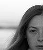
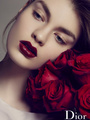
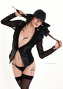
I'm pretty much new and novice at retouching, and primarily use Lightroom 5 for post production. I have really rotten luck while trying to make the image pop out. Based on the below example, can anyone guide me on LR how to add that definitive glamorous glow to my images  Apr 02 16 11:12 am Link my goto start is curves, when people talk of making an image pop, they usually refer to contrast. Curves are the best way to fine tune that and some quick, global color issues in one adjustment layer. Apr 02 16 11:34 am Link It's not about luck but about technique. As Motordrive said - to make things "pop" you need to increase contrast. Global contrast is obvious. For making the so called glamorous glow you use local contrast. You can use adjustment layers which lighten and darken the image and paint soft selections to determine where you want the image to glow or be darker. Apr 02 16 01:12 pm Link Lightroom 5 has a special "Adjustment Brush" that most people dont know about... or regularly use. It can take the place of 15 Photoshop Kind of adjustments... but you dont have to go into Photoshop to get them. These 15 paint on brushes like exposure, contrast, clarity, saturation, color etc...are all in Lightroom!! Hit the Command or Control K to get to the brush while in the develop module. Its icon is also right below the histogram and it looks like a small lollypop. When you select this brush...the main develop menu changes. It now gives you 15 Photoshop-like parameters you can paint on your image directly and transparently and with the ability to make adjustments at any time. To create POP: When you lighten a part of a picture... your eyes and brain are instantly drawn to it automatically. Use this adjustment brush to lighten the face... or where ever the important place in your image is. In your image...click down with the brush to set its in-point anywhere in the image...then begin painting on the face. You will see the face brighten up and it will become more forward in your image... and your viewer will be more interested in looking at that part of the image... or other feature. I usually start by setting the brush size to medium size... and re-adjust it to a lower flow rate in the 20-30% flow range. To apply the effect... I move the exposure slider to the right to maybe +2 or +3 units to cause an exposure lightening to be painted on the image. Now paint. You will be selectively changing the exposure to highlight that part of the image... This creates visual POP. You can go back to the exposure slider after you have painted with it... and then re-adjust the painting brightness to become any exposure value you want...Up or down. You should adjust it so you are happy with the look and it helps your viewers eye to get stuck on that part of the picture. Hit Control K... to get out of the brush...then hit control K again to pick out another brush parameter you want to paint onto your Lightroom 5 image. You can make your brush paint in any of the 15 effects you see on your menu!!! Play with that painting. You can drag the exposure to be darker or lighter or bring it to any brightness value you want AFTER you have painted it on too! Hit Control or Command K to add a double portion of any effect by double painting on that same area again...or choose another parameter to paint on. You can paint on de-saturation, or you can paint on Clarity, or minus clarity for smoothness of skin, you can paint on contrast anywhere you want. Keep making any and all creative adjustments to your image. Its non-destructive, and clear, and changeable, at any time...so you can paint on 10 factors anywhere you want, change your mind 5 times...and everything will still be OK. You can create visual POP in an image at least 10 ways: 1.When you add brightness to an area (To attract the viewers eyes to it). 2. When you add contrast to an area.(The eye is always attracted to contrast). 3. When you sharpen an area (The eye is always drawn to areas of strong sharpness...and away from areas of blur). 4. When you warm that area (Add a reddish or warm color or tint to an area...even slightly. Warm colors advance). 5. When you blur the background or some other unimportant area (The eye hates to look at blurryness). 6. When you make your background colors cooler. (The eye is less attracted to cold colors. Cold colors recede to the back). 7. Use contrasting or opposite color wheel colors. (Opposites or triads on the color wheel are always dramatically strong) 8. Use elements in a image, such as lines, to draw a viewers eye toward your area (Leading Lines). 9. Make the focal point of your image be a physically larger part of the overall image (Good cropping to create focus and POP). 10. Use just a little bit of framing or vignetting in your image (It draws the viewers eye to the central part) All of these elements help you to create POP in an image! Good luck Ray Apr 02 16 10:26 pm Link PhotoKromze wrote: Motordrive Photography wrote: anchev wrote: actually you are both wrong. while, in some cases, it maybe contrast. specifically, in this case, it is not. Apr 02 16 10:51 pm Link The first thing you could/should do is to bump the exposure up on your original image - that will go a long way to making post easier also. Apr 02 16 11:21 pm Link Leonard Gee Photography wrote: the gods have spoken, tsk tsk tsk Apr 03 16 12:38 am Link Leonard Gee Photography wrote: Nice to see someone that know what his talking about. Apr 03 16 06:02 am Link A tip which can help when assessing the image is to view it as Greyscale to see how it works tonally. This can be helpful because it's difficult to assess the tone values when you are looking at colour. You can have a quick look at the image in greyscale using a Hue/Saturation Adjustment layer with the saturation slider at zero, and the blending mode of the layer set to Color, so the tonal rendering is Perceptual (the way the eye sees tone). If you don't get the tones right, no amount of colour/saturation tweaking will make your image pop. Apr 03 16 07:20 am Link Thank you guys for the response!! I'm really glad you all took time out of your busy schedule to help me, and definitely it has provided me with a lot of insight and ideas to work on LR, maybe even run through a tutorial once more  Having said that, don't stop!! Keep the suggestions coming Apr 03 16 08:27 am Link Apr 06 16 05:37 pm Link  2 minutes in Topaz Texture Effects Apr 06 16 11:43 pm Link Leonard Gee Photography wrote: DarkSlide wrote: I'm not sure if he's in the pantheon of gods, but he's absolutely correct - it is an exposure & lighting issue. Apr 07 16 07:03 am Link PhotoKromze wrote: it starts in Camera. Apr 07 16 08:10 am Link For the lucky punter  Or perhaps, as suggested above, try to find out exactly what it is you want, then watch some of the many YouTube offerings ...maybe go back a step and learn a little about your camera settings and lighting? Good luck. Apr 07 16 02:15 pm Link Frankly, I think the image as posted is contrasty enough color-wise. The blue outpops the model. Also, there is a huge block of black hair. So .. I'd change the background to something more complimentary (on the color wheel) to the skin tone. I'd desaturate the image. There's almost too much color. I'd dodge the highlights on the hair to add shine and texture. I'd add some eye color to the iris. The eyes are very dark. I'd add more contrast to the face by dodging and burning a bit. The lighting seems flat. I'm using Photoshop, so I added a little more lighting to the side also.  Apr 24 16 06:17 pm Link In my opinion, pop means the subject being distinct from background. And that is due to several aspects: 1, saturation. One or two colors pop will be inpressing. Don't make it all colors, don't make highlights and shadows high saturation. 2, contrast.....could be H,S,L. 3, sharpness vs blurness, for example bokeh Apr 29 16 05:15 pm Link You mentioned making the image "pop" and not specifically contrast. So there's actually many different ways of doing this. You can either increase contrast & viewing through greyscale as AK mac mentioned to make sure your values are good. Another popular one as seen in films, the blockbuster color grading, where you make the skin pop by using the complimentary colors, orange skin, teal surroundings (warm protrudes, cool recedes -though this is contingent as well). You can also desaturate the background and keep the skintones neutral or saturated. You can also control the sharpness/detailing in areas you want to show focus most. May 22 16 05:42 pm Link Like everything else, it starts with art direction. Fail there and the dominoes fall. May 23 16 08:27 am Link |