|
Forums >
Digital Art and Retouching >
What do you think of my website/skill level?
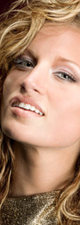
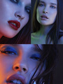
Hello MM Friends, I'm trying to create a retouching career for myself, and I'm curious to know what experienced people think of both my website and the caliber of my abilities. Also, if there are specific things you notice that I should really work on, I'd appreciate the input. The web address is DAVIDWL.COM Thanks so much for any feedback! David Mar 07 16 01:32 pm Link The images look great, the web site looks rudimentary. I suggest a flash gallery to spice things up a bit. Mar 07 16 01:41 pm Link CharlieMW wrote: I'm actually using a website template, but maybe I can choose a different one from the options. Hopefully it all at least comes across as clean and professional. Something to definitely think about though. Mar 07 16 03:33 pm Link Simple, clean, the images pop. I actually like it a lot, really focuses on the imagery instead of too much other clutter. The only negative to me was that it took me a second to figure out how to view the next image. The prev/next button was down in the bottom corner and I had to scan around a touch to find it. Clicking on the image worked too, but there the cursor changed to a strange indicator when hovered over the image. Perhaps changing that cursor would be in order. Mar 07 16 06:09 pm Link I like your example images...very crisp, vibrant and attractively done Mar 07 16 07:25 pm Link Hi David, Your MM port looks good. Perhaps try to make it more interesting by putting more unpopular pics rather than the samples which almost every retoucher on MM puts. The website content: I don't think the landscape/nature and places/travel are adding anything to it. An out of focus picture of a goose does not show your good retouching skills. I would remove those completely. CharlieMW wrote: As a frontend web developer I highly don't recommend anything like that. Flash is a closed, vendor dependent technology and a potential security hole for any website. There are thousands of html5 templates if one wants to improve interface. Mar 08 16 01:47 am Link anchev wrote: I know, that goose pic needs to go. Can't figure out what it is about it that I liked and why I've kept it up so long. I've actually gotten some paid work because of the nature/places pages, so I'm hesitant to remove them, but I think that is the long term goal once I get more content in the fashion/beauty section. Mar 08 16 06:51 am Link YW, David. I also have thousands of old pictures which I like but they are not suitable for retouching portfolio. You can probably upload some better landscape/nature images to show better your skills if you have clients about that. Mar 08 16 07:09 am Link Your work is really nice, nice touch and nothing is overdone. If I was hiring retouchers I'd certainly give you a shot.  Mar 08 16 07:22 am Link Box Top Photography wrote: Thank you! Mar 08 16 07:46 am Link It looks very good to me. What I would do I would reduce the number of pics in the portrait/beauty/fashion section, 28 is to much (if you aske me which one to remove I would recommend the three Anny Sawyer pictures) and find a better sample for black and white with Gibson) Mar 08 16 09:30 am Link CharlieMW wrote: NO DOn't put flash website just HTML 5 // flash is not compatible with all IPHONE and other device is not good Mar 13 16 03:46 am Link David WL, if I were you I wouldn't worry too much about your website, focus first on collecting a good bunch of quality/professional/non Model mayhem images and also focus on stepping up your game as at the moment, based on the work that you show on your website I feel you really need to fixed quite a few things in most images to make them look professional. The competition is huge out there and trust me you won't get too far at the moment but with a bit of a push and determination and maybe some help you can definitely get there. :-) Mar 14 16 02:30 pm Link The Invisible Touch wrote: I appreciate your honesty. And thanks for the push. Mar 15 16 10:59 am Link |