|
Forums >
Digital Art and Retouching >
I got a beef.
What is with all these color profiles? Cripes! Every week someone jumps in with some new one. We have Adobe 1998 RGB. Bruce RGB. BetaRGB. CIERGB. dinax Barberi RGB. Euro whatever. Nikon RGB. Apple RGB. Bunch of CMYKs. Wide Gamut RGB. wsc RGB. More for TV. More for Video. Bunch more for print. Bunch of YCb.. somethings. sRGB xxxx. These are what are in my current Windows color spaces, and It's growing! Then we have these marketing tales about their monitor's RGB color gamut coverages and what they claim. So a monitor maker says, "We have 100% Adobe RGB" or whatever. If theirs has more red than that of Adobe's 1998 RGB triangle than say green, so yeah they are less than Adobe, but they cover much more red with their own in the CIE colorspace? Does that now make them 110% of Adobe 1998 RGB even though they do not hit the green/yellow of Adobe, but include more of the red/blue? Kodak had the right idea with their monitoring "Control Strips" for either color negative, paper, or Ektachrome slide film for lab processing. Only three ways to go there with film for "references." Now we got a total mess with digital - and it's growing and getting worse! Who knows what is right anymore and on what and whose screen the image appears on and in what color profile setting made by whom and what? Someone needs to establish some standard and reference as this is getting out of hand, imho. /rant Jan 24 16 05:25 pm Link No, you just have to decide what's right for you, that's all. BTW Kodak went out of business because they didn't keep up with the times. Personally, I just stay with the red (magenta for those that forgot or don't remember), cyan (blue me away too), yellow (because the sun said so), and B&W because I grew up way before many of you were even able to handle a camera. But, yes. it can get to you if you let it - so rave on. As long as we're getting our frustration out, I really cringe when a photographer has never shot with film, or developed film, or used the wave of a hand to allow the eye to bring out the light balance/correction in developing out film negatives on photo paper. Nor have they learned what ISO/ASA is, what an aperture or light speed is, how to do a long exposure and have it come out right WITHOUT the use of a meter (just knowing it because of experience), or why old men have a fondness for hair - real hair and it can be 60 and still be sexy. Especially when it is shot with Kodachrome on an Instamatic. Jan 24 16 08:32 pm Link These are Color Spaces and not Color Profiles... Each device MUST have its own Color Profile and each Color Space have or had a logic behind its existence at its time of making... 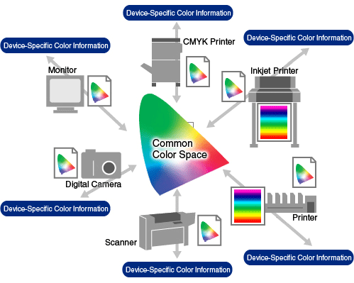 Technology evolves and what was good in the past nowadays maybe is not... As long you use a 100% color managed software, leave the differences to the color management system and that is it, no more or less... But we must understand what a Color Space is, device profile and etc... We choose the proper Color Space keeping in mind what the output will be. Example: IF the output is web, use sRGB Color Space IF the output is printer X, select a Color Space that is big enough to cover all the printer gamut, it will also depend on the paper type see https://www.modelmayhem.com/forums/post … st19468076 Lots of great stuff at http://www.digitaldog.net/ Do not miss the videos: #1- http://digitaldog.net/files/ColorGamut.mov #2- http://digitaldog.net/files/WideGamutPrintVideo.mov #3- http://digitaldog.net/files/Why_are_my_ … o_dark.mp4 The complete thing http://www.trainsimple.com/CourseDetailUser.aspx?id=119 Some info that may help, but not "full featured" as the above link. http://www.dpbestflow.org/color/color-s … r-profiles http://www.cambridgeincolour.com/color- … inting.htm http://www.color.org/faqs.xalter BTW, here basically I calibrate the monitor to gamma 2.2, 6500K and in its native gamut mode, I do not limit the monitor gamut by selecting sRGB or Adobe RGB emulation modes, I keep the monitor this way even when working in sRGB as long the software is color managed we do not have anything to worry. IF the software is not color managed then I set the monitor to sRGB emulation mode. The #3 video from above gives good tips about values for monitor calibration. Jan 24 16 08:36 pm Link Nice treatment Pictus. Thanks for the thoughtful resources. Jan 24 16 09:04 pm Link Pictus wrote: Nice lesson. I sure good use a GREAT assistant with your knowledge. - just an old man saying "hey". Jan 25 16 06:32 am Link Thanks Pictus! Good stuff, and yeah about that color space instead of profiles correction too. I'm just annoyed at how long it took to get this thing working right when it worked well at the store. It was stumping the support people as well. I found the issue on the web and posted the link below that settled it (I hope!). Still, this should be more "Plug-and-Play" than it is. Its becoming a hodgepodge mess to dig through to make it work. For instance, I didn't know that Nvidia, by default, restricted the HDMI output on the notebook to RGB 16-235 instead of 0-255 that you pointed out earlier in another thread. Got that sorted out in the driver control panel and it still wasn't fully 0-255 even when I set it! I ran that RGB=0-255 patch to force it to 0-255 and it reported back a couple of more registry entries were changed as well even though the Nvidia Control Panel said it was 0-255. So I thought all was well and fixed, but turns out it wasn't. Still no shadow detail. In short, the monitor I bought (Eizo CG248) was right off their demo cart with the PhaseOne 100MP camera setup. It was running off the Apple Mac "Trashcan" computer and it showed that Jon Cone B&W RGB Shadows test image in which we all could see down to the #1 in the store even under bright lights. So Yay! I took it as I knew it worked. Fwiw, the one next to it didn't get below 15 running off a Macbook Pro which seemed odd even though they calibrated both that AM for the PhaseOne guys and their demo. That one was the CG247 (Older non 4K monitor, and soon to be discontinued too against the CG248.). So with the demo CG248 in hand that I could see the "Cone #1" in the store, I take it home and plug it into Windows 10 and back to maybe numbers 15-17. Arrgh! So I applied the RGB correction above and it's still was stuck at Cone #15-17, but the notebook improved a little. What da foo is going on here? Got the Eizo rep on the phone and we tried different settings and sundry calibrations, but it refused to show any shadow detail below 15. It didn't come with a mini-port DVI cable to try the other notebook's video out jack over the HDMI output, but that cable is coming so we'll see if the mini-dvi and HDMI outputs are different soon. Back to the "No shadow details on the new monitor here" saga. Turned out there were other settings on the Nvidia card "Color Output" that needed to be changed from RGB to some YCbCr444 standard in order for the HDMI output to change to see down into the shadows of maybe 2-4 now of the Cone image which I can live with, but not that 15-17 nonsense. There also was another YCbCr222 in there too, but which is right? This info was on someone elses website and not found on Eizo, Nvidia's, or x-rite's site. Explains a lot of issues with Nvidia, AMD and HDMI outputs as well: https://pcmonitors.info/articles/correc … -amd-gpus/ Not exactly plug-and-play and I suspect many out there have wrong setups too and don't even know it. I did run x-rite i1 Pro2 calibration and thought all was well and good. Turned out even if it passed and generated a profile in a set colorspace, it was wrong since the Eizo wasn't getting the full HDMI color signal out of that Nvidia GTX980M card via that YCbCr444 non-default hidden setting which changed everything. Even now when within the constraints of the sRGB colorspace, moving an image between the two monitors there is still a difference in color, especially reds. I know the panel in the cheaper notebook should be different even though they claim 100% sRGB, but I doubt a lot of these marketing claims. That Joe Brady guy of x-rite webinar fame was right when he said "No two monitors are exactly alike" - but they should be better and easier to get to some sort of agreement than this. Fwiw, for others, the "Cone Shadow Test Image" and explanation for shadow detail on a monitor is mentioned here: http://www.piezography.com/PiezoPress/b … i-need-it/ Funny a few comments there have issues with it too. I could have joined them! ** Sorry about the very long diatribe. Maybe someone will glean something out of this expensive learning experience. Jan 25 16 09:01 am Link TMA Photo and Training wrote: You are welcome. Select Imagery1 wrote: Glad to help and I say: Hey! yeah yeaaah, Hey yeah yea GRMACK wrote: Glad to help, the true name is "Plug-and-Pray" GRMACK wrote: Just a reminder that is to save the JPG and view into Photoshop and *not* in the browser. GRMACK wrote: Mini-dvi? DVI can not handle 4K resolution. GRMACK wrote: Very good link, all the needed info is there, thanks. GRMACK wrote: True, "no two monitors are exactly alike"... Even harder when comparing the extremes of the spectrum, the Eizo TOP model with a notebook screen... GRMACK wrote:
Jan 25 16 12:52 pm Link Pictus wrote: Yes. My mistake. It showed up and is a "DisplayPort to mini-DisplayPort" cable (Eizo # PM-200). Looked much worse than HDMI too so back to that cable setup instead. Wouldn't allow me as many settings in the Nvidia Control Panel either. Jan 27 16 08:35 am Link |