|
In an effort to clean up around our ports, lets help each other out! Tell me if you want to know why... I would love to know why for mine... Thank you!! Apr 19 20 06:10 pm Link Well I don't have many in mine but trying to work on that! For yours, I am not a fan of the multi-image posts, too small to distinguish much; the weird angles do not look right, fine for personal posts; and you have several occasions where different models are posed the same with the same composition right next to each other like these - https://www.modelmayhem.com/portfolio/pic/15651831 and https://photos.modelmayhem.com/photos/1 … a95_m.jpg, There are several more through the portfolio. There is some very good shots in there, maybe just a bit of thinning. Apr 19 20 07:39 pm Link  No neck. Apr 20 20 09:13 am Link For yours, I think this one: https://www.modelmayhem.com/portfolio/pic/44890159 I like the one next to it much more. Maybe it seems too busy. maybe the lighting isn't as good. Some of the distortion doesn't appeal to me. Apr 21 20 09:17 pm Link  Cheesy, stiff pose. Dull expression. Eyes are too far into her sockets. Terrible backdrop. Bad mix of colors. Tacky shoes. And WTF is going on with her neck?? Good looking model and great figure, but this shot doesn't flatter her one bit. Apr 22 20 02:26 am Link https://www.modelmayhem.com/portfolio/pic/28210469 Curves are missing, hidden by her garment. Model’s trying to do too many things at once - Feet are awkwardly turned in, knees closed, but she’s pulling her skirt up sending a very contradictory message. Her left hand is up by her neck/ head for no apparent reason other than to pose. You have better work than that! Apr 27 20 09:45 am Link Zeelon wrote: Thanks for the insight!! May 03 20 01:47 pm Link Jorge Kreimer wrote: Least fav... to bright IMO... May 03 20 01:52 pm Link Fist Full of Ish wrote: Thanks for the insight! May 03 20 01:55 pm Link Eros Fine Art Photo wrote: Thanks for the insight! May 03 20 02:02 pm Link Quentin Studios wrote: Thank you! May 03 20 02:07 pm Link Oh, this is fun!!!! Like one of the big wrestling matches where we get to trash talk each other  OK Ok.... my turn 1st off, I think your portfolio is much too big. So trimming it down is the right impulse. I would kill this shot: https://www.modelmayhem.com/portfolio/pic/44404768 Great model and location but he looks like she's caught between poses, her knee aligns badly with the background and I would try to warm up the surface she is on to bring out a nice gold colour. May 07 20 06:50 am Link I dont think you have a worst shot - but the portrait of the elderly man seems really out of place May 08 20 01:15 pm Link Hi, I considered the images at face value and also took into account what I would have changed to make the images more aligned with my taste. This one stood out - https://www.modelmayhem.com/portfolio/pic/40556415. I would have changed the alignment to level the stairs (I don't see how the Deutsch/Dutch angle adds to the effect) and cropped a bit wider to get a bit of space over her head and more towards the knees. It's a beautiful image. I'm would appreciate any feedback. My portfolio is sparse at the moment. May 08 20 10:49 pm Link Nasher wrote: -- May 09 20 08:10 am Link Garry k wrote: Thanks for the input! May 09 20 08:13 am Link MOSpix Michael wrote: Thank you! May 09 20 08:16 am Link Thatcher Photography wrote: Thank you, I concur. May 09 20 10:04 am Link I haven't shot in a LONG time so there's probably a few candidates in my portfolio, but have at it. (Let me know why.) I generally do not like portfolios that are so big. I paged down a bit and this one caught my eye as an image I didn't really care for, amongst a lot of very good shots. It's flat, the model doesn't "do it" for me, her facial expression is off-putting in my opinion. Thanks and have a great day! https://photos.modelmayhem.com/photos/1 … 247951.jpg May 12 20 06:15 pm Link May 23 20 09:38 am Link Omaroo wrote: Cute shot but this is better for a blog of website due to no model... May 27 20 10:45 am Link Dan OMell wrote: Thanks! May 27 20 10:48 am Link Cute shot but this is better for a blog of website due to no model... Good point. Thanks. Jun 04 20 05:08 pm Link Jun 04 20 07:48 pm Link Fist Full of Ish wrote:
Jun 05 20 04:11 pm Link If you have the time and patience to go through too many pictures..... Jun 06 20 07:32 am Link https://www.modelmayhem.com/portfolio/pic/38038131 Possibly this picture...Maybe the angle makes me see the skirt above anything else Jun 06 20 08:07 am Link Thatcher Photography wrote: Thanks. The pose on the last one bothers me some. Jun 08 20 09:54 pm Link IMAGINERIES wrote: My least fav... Jun 18 20 01:14 pm Link Nov 06 20 11:38 pm Link https://www.modelmayhem.com/portfolio/pic/34173185 You are a very good photographer but I think this shot is not up to the same level of most of your work. Nov 10 20 01:49 am Link Noah Russell wrote: Thanks!! Good feedback! Nov 24 20 11:02 am Link Tommy Pivot wrote: Thank you!! Nov 24 20 11:06 am Link I changed my mind, I think this is your least striking image. The lighting is way too harsh and there is no context to justify it, it's your worst imho https://www.modelmayhem.com/portfolio/pic/34747753 Nov 25 20 10:09 pm Link 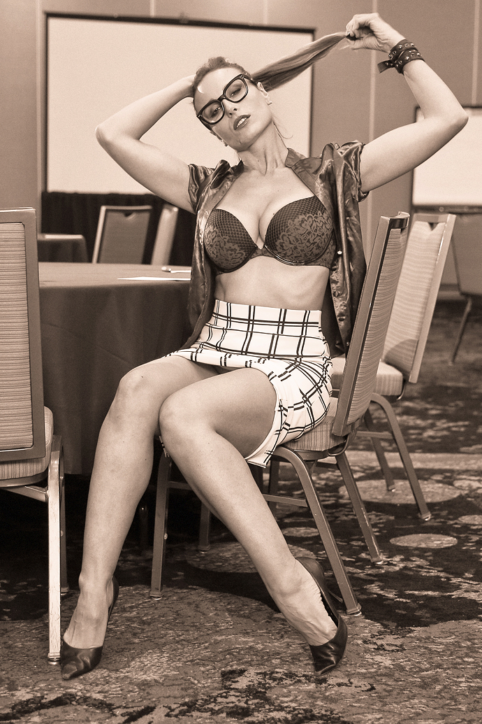 With trepidation over what I perceive to be too many mediocre shots in my own portfolio (I add each day's POTD & POTD 18+ entries and have not taken time to cull the too-many images for a while), I settled on this shot from your portfolio for several reasons. There are some intriguing dissonances that could make for a great image--which is why the distractions are so off-putting for me. The location and the theme, of course, juxtapose. But so does the silk blouse against the plaid skirt. The apparent setting for a presentation having ended recently would suggest the possibility of a celebratory strip-down (and whatever other activities are implied), but the room seems set for the presentation yet to be started. And even though the business attire contrasts with itself, the bondage-theme leather bracelet pushes the juxtapositions in yet another direction. Finally, the angle from which the photographer shoots suggests an impending approach toward the model from a kneeling position. And that makes the spot-black-and-white amidst the sepia-tone seem even more suggestive, and yet even more distracting. In its thumbnail form in your portfolio the black-and-white against the sepia causes the lines of the plaid to appear blue. Spot-color, as spot-black-and-white, over the sepia tone...causes the image over-all to leave me unengaged, rather than focused on the model's middle grounds as seems to have been the intention. And yes, please note any details you'd care to share about the worst/least favorite/most unsuccessful shot in my portfolio. Yours, Bill Dec 01 20 07:22 am Link Rik Williams wrote: Thanks!! Dec 16 20 10:44 am Link Fall River Photo wrote: Wow! Thanks for the detailed info! Dec 16 20 11:00 am Link Thatcher Photography wrote:
Dec 26 20 07:31 am Link photodw wrote: LMFAO!!!! Jan 06 21 11:40 am Link Thanks for the feedback with which, in retrospect, I fully agree. Jan 10 21 03:42 pm Link |


