|
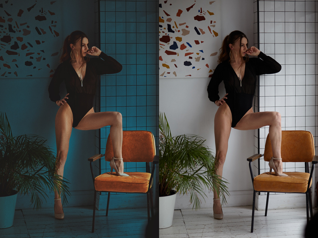
The color does matter in photography, that’s why I pay great attention on it while correction. How do you like the new color combination? https://cdn.myportfolio.com/d565e2d0de9 … abff083e1d Apr 25 22 02:29 am Link I think the blue is too strong and is competing for dominance over the orange Apr 25 22 05:49 am Link I think the blue & orange combination detract from model -- I see colors, not her. Apr 25 22 09:38 am Link Great legs, anyhow! Who is the model? Apr 25 22 10:35 am Link Color can be very subjective, some will like it some wont. Apr 25 22 02:21 pm Link The overall blue tint of the image especially over the artwork in the background and the plant in the same plane as the model without any sort of bleed over on to the model strikes me as an image where the the lighting manipulation is off. However if that's the look you wanted and you like it, then that's good enough! Apr 25 22 06:10 pm Link I like it. Model stands out more. Apr 26 22 04:38 am Link The image on the right looks more natural and it would be my choice. But as we all know art is in the eye of the beer holder. You may want to add the 18+ warning to your link. MM's new rules would dictate that image as mature. Certainly doesn't bother me. Apr 26 22 09:04 am Link Retoucher Daniil wrote: My parents raised me not to see color. Apr 26 22 06:12 pm Link IMO, I think the color should take second actually third stage as it would seem 1st.the model should be the star of the photo 2nd. the lighting ( dodging and burning, shadows ,highlights etc.) and 3rd the coloring the lighting should be focused to bring the model out more the chair has more pop than the model I know that you did bring the lighting (some) up on the model but if you look at how much detail just in the definition of her legs is lost which may be because of the color you have added not sure if I am hitting the nail on the head but that's just my thoughts I also may have cropped in a little tighter as the crappy floor and plant aren't bringing a lot extra to the photo. But I do agree it all a personal choice. Thanks putting it up for critique. Apr 28 22 02:52 pm Link The color does not matter if the lighting is off. Apr 28 22 06:37 pm Link I think you chose a great color for the image, but the issue is that the model wasn't well lit in the original. It worked because the model created contrast against such a white background. But, recoloring the background took away that contrast, leaving no real point of interest in the frame except the orange chair. I think if you give the model more pop, you'll have a nice edit. Apr 28 22 08:25 pm Link You do not seem to have changed the exposure of the model or the chair, but adding the blue background makes the photo look darker and less attractive. As things stand, I would prefer the original pale background, but the blue could also work if you lightened it a bit and reduced the shadows on the model and chair. May 22 22 05:16 pm Link color is consistent with differences in race and culture Jul 20 22 06:11 am Link Papro wrote: What do you mean? Jul 22 22 12:11 am Link Papro wrote: roger alan wrote: I'm pretty sure he means that the same color can either be appreciated or disdained by people due to their differences in race and culture (and political beliefs and superstitions too, which can probably be categorized in race and culture). Jul 22 22 09:36 am Link @SayCheeZ! Thank you for an intelligent and thoughtful response. I could also answer my own question as to how the comment I quoted might be possibly interpreted. But Papro is a whole different person. I quoted him directly because I would like to read HIS response. Jul 22 22 04:05 pm Link the strong neon type of blue that is should be from a blue light, my opinion is gradient fade some blue out from the left wall, so the colors come back, move light to shadow on the plant, the orange is a world better in the blue, model's pose is a little sturdy or not fully expressing what the imagery represents, we either need that or to see more detail or something else as to what she's representing Jul 26 22 01:00 am Link roger alan wrote: I meant everything @saycheeze said but I'd include that the consistent idea of w white wedding dress and "religion" being "whiteness" is different from Africa or Egypt being "blackness" is not what I'm referring to although there's explanation for that. Jul 26 22 01:16 am Link Generally, when the entire environment has a blue cast, the subject matter between the light and wall should also have a blue cast. If you wanted her to stand out anyway, then you might consider having some of that blue bounce back onto the model from behind. The reflections, for example, on her skin, are from a white light reflection, not blue. Instead of it looking like you modified the BG, it actually, instead, looks like you just cut her our of one photo and dropped her in another. Dec 23 22 05:27 pm Link I don’t mind it it ( but it needs to be lit better ) It really emphasizes the chair and de emphasizes the Model - but maybe that was your intention If You had something in a similar shade of orange on the wall above the Models right shoulder - I think the viewers eye might be drawn back and forth between the 2 orange areas and in the process the Model would be more visible Dec 24 22 08:40 pm Link David A Reichel wrote: Well said. Dec 26 22 10:45 pm Link absolutely color do matter. but i believe a balance must be there. I am an aspiring colorist. and if you see my instagram; u will notice a wide range of color;not only teal n orange; but others too. i try to strike a balance with my colors. would love ur feedbacks on them. www.instagram.com/rick.chakraborty24 Dec 28 22 08:51 am Link |


