|
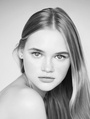
Hi All, Could I please have some constructive critiquing on my retouch of this photo of Nikki Sofie by William Clark as so that I can develop and improve? What sticks out to you that I should focus on? Do you have any tips for colour grading, and how would I go about fixing the texture on her shoulder? Do I need to resort to using frequency separation, or is it fine to leave as is (should it be left as is)? Many thanks, Katy  Photographer: William Clark - www.WilliamClarkPhoto.co.uk Model: Nikki Sofie Retouching: Katanya - www.katanya.com.au Large 2048px high: retouched and original Jul 15 21 10:36 pm Link Overall, I like what you have done with this image. I think the color is better, but might have gone a little yellow. Wondering why you took out nose ring? The hot spots still bother me a bit, I dont know what could be recovered, or if this is from a RAW file. I try to keep a dot gain of at least 1 or 2 even in highlights. You have done well with a subtle, not over the top retouch, good job. Jul 26 21 02:37 pm Link Thanks for your feedback Motordrive. I really appreciate it. Looking back on it I see what you mean by she's a bit too yellow now - I'm rather struggling with skin tones. I either currently make them too red, too green, or too yellow! Do you have any tips on how I could refine it, so my colours aren't so skewed (I have calibrated my screens, but I don't know, I struggle to see the variations)? Or does it just come with practice? I thought that by removing the earrings it may be a bit strange to leave her nose ring - I was also aiming for a really clean skin sort of a look if that makes sense. I also figured that because it wasn't a permanent feature that it wouldn't hurt to remove it. When I processed the raw file I tried to knock back the highlights in there - it didn't seem to make any difference though. Sorry I'm a real newbie - what do you mean by dot gain, and how do I do that? Is that something to do with curves? Many thanks for your help Motordrive, and your kind words. I hope you're having an awesome day. :-) Jul 26 21 11:06 pm Link When starting out, it's common to wrestle with skin tones, especially if you didn't shoot the photo or have a Color Checker reference shot for that group of images. So in those cases, use the info pallette and my rule of thumb. (usually set at 9×9) cyan value about 1/4 of the magenta value and yellow is 1 or 2 higher than magenta. (note, I don't change the image to CMYK, I just see both RGB and CMYK in the info) and yes, practice helps. I hadn't noticed the earings were gone,  and it looks okay with and without nosering, but I know and it looks okay with and without nosering, but I know from experience, doing retouching for others, the shot might be for example a jewelry store, or a stylist that chose what the model wore. From start (RAW file) to finish (ready to print or export), I try to keep tabs on four different values to not go out of gamut for the intended use. Kind of like the zone system in the film era 1) D-max is the darkest pixel 2) High densty is darkest shadow you need detail in 3) D-min is the lightest pixel 4) low density is the lightest place you need to see texture. A dot gain of 0 would be blank paper in those areas if you printed it on an inkjet for example. I use both curves and levels to change those. Jul 27 21 05:52 pm Link Thank you for getting back to me Motordrive - I really appreciate it. Sorry I didn't reply earlier today - I saw your comment regarding the skin tones and tried to apply it to another image. Thank you for giving me a starting point - I will have to tinker with it further (also, I think the image I tried it on wasn't uh, the best image to use). When I get clients I'll be sure to ask them what they want and expect in regards to retouching - I wasn't sure about this one (it was just one of those practice images from the net). :-) I don't quite understand the values thing yet I'm afraid - I've never really had much experience with photography tbh (I did a year in uni as part of my degree but that's pretty much it - nothing professional or anything interesting) so I'm definitely going to research into it further. With the dot gain of 0 - is it bad to have areas where you rely on the blank paper in photography? Sorry for all the n00bish questions. And many thanks yet again :-) Jul 28 21 03:09 am Link My suggestion is that you can first unify the brightness of the shoulders and the face in the black and white observation layer. As for the color, I think it is easy to solve Mar 30 23 02:41 am Link |