|
Thanks for view and comment!  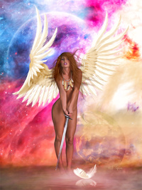 Jul 01 21 12:12 am Link I have studied your MM portfolio and other on-line resources and was hugely impressed. Your work reminds me of artists from the middle of last century whom I really admire, such as Gil Elvgren, Rolf Armstrong, Art Frahm, Willy Pogany and others. Accordingly, I am reluctant to offer critical comment to someone as talented as yourself, especially given my own lack of expertise in editing and retouching. I hope that my thoughts are not too far from the mark. There is a lot to like and to be impressed by in this image, but, with the greatest of respect, I do not think that it stands with your best work. My thoughts concern two aspects: the pose and the composition. For me, the pose looks a bit awkward although i do get some sense of fury from the drawn sword and her facial expression. However, she also looks off balance and not really ready to fight. I do not wish to be unkind, but her stance seems more consistent with being a golfer than a warrior. I think that the root cause of the problem is the placement of her feet. The tip-toe stance looks more like a transition to a pose rather than a pose in its own right, and, apart from itself being awkward, it creates awkwardness around her hips. The hunched shoulders would have worked better had her elbows been bent to create some impression that the sword was ready to strike. The intent may have been to use the lowered sword to create a sense of furious impotence, but the foot placement would still be a distraction. The composition seems more complex than in your other works, but I prefer the simpler ones. The "horizon" that runs through her ankles is distracting in that it obscures her feet, and, paradoxically, in so doing, draws attention to them, which may be the opposite of the horizon's intended purpose. The two moons may be one moon too many. The larger, upper moon frames her face and wings very well. The smaller, lower moon seems to impinge on her leg. I tried imagining a different placement for the smaller moon but could not, so I would be inclined to remove it or use a smaller version. However, doing so might leave the lower right corner looking a bit bare especially as the colouring in the lower right quadrant has been shifted from red-pink-purple to yellow-orange. If you remove the second moon, I would experiment with rendering the lower right quadrant in red-pink-purple, blue-purple, or something similar. This would also resolve another matter in that I feel that there are too many colours in the background and I would try to recolour either the lower right quadrant or the blue-purple upper left quadrant. The white feather in the foreground seems to compete too strongly with the winged figure. It is comparatively large especially with the mirror image and being strongly white. Making the white areas less bright might reduce competition, but I would be inclined to remove the feather to put the focus more squarely on the model. As I mentioned earlier, there is much to be impressed with in this image, but, in its present form, I do not think that it stands with your very best. I hope that these comments are helpful. Jul 30 21 05:46 pm Link |