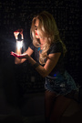
Forums > Critique > Fun and Games > Worst Photo of the Person Above You

Photographer

Megan Gardner

Posts: 1027

New York, New York, US

Sep 17 16 06:16 pm Link

Photographer

Kinky Vision

Posts: 22

New York, New York, US

https://photos.modelmayhem.com/photos/120303/09/4f52520b08371_m.jpg

Her pose seems uncomfortable and awkward.

Sep 17 16 09:35 pm Link

Model

Ana Lancova

Posts: 68

Powder Springs, Georgia, US

https://www.modelmayhem.com/portfolio/pic/38730945

I think it is the setting that is throwing me off. It looks more like something some couple would take before going to a kinky party and less like the quality of the other photos found in your port.

Oct 11 16 05:23 pm Link

Photographer

Buck Remington

Posts: 21

Beaverdam, Virginia, US

https://photos.modelmayhem.com/photos/161017/18/58058039eb1e6_m.jpg

The post processing has taken away all the important details, and pushed hard lines where there shouldn't be any.

Oct 18 16 06:29 pm Link

Photographer

Nor-Cal Photography

Posts: 3719

Walnut Creek, California, US

Buck Remington wrote:

Well, we certainly work in different genres!  I picked this one:

https://www.modelmayhem.com/portfolio/pic/34155852

because the right knee is sorta in my face.  Also, not good contrast between the model and the background.

But just one worthless opinion.

smile

Feb 11 17 03:08 pm Link

Photographer

I Ference Photography

Posts: 1202

Brooklyn, New York, US

Nor-Cal Photography wrote:

This one:

https://www.modelmayhem.com/portfolio/pic/39583462 (18+)

The lighting is just... not... good.

It's fairly flat on the model - except where there's a blown highlight.  These lighting *might* have worked in B&W if you were shooting something like Efke KB25 or Agfapan 100 and exposing & developing for lower contrast - might even have been compelling.  But here it's just blah.

Feb 13 17 02:06 pm Link

Model

evavonrose

Posts: 55

Des Moines, Iowa, US

Me, so I know which one or ones to cut.

Mar 15 17 08:34 pm Link

Photographer

roger alan

Posts: 1192

Anderson, Indiana, US

Rose, you are supposed to pick the worst pic of whoever posted above you, and link to that pic using the MM Forum Code (if the pic is G rated) or the Raw Link (if it is M rated). Don't worry, you won't hurt anyone feelings or anything like that. It is just ONE opinion and anyone who posts here expects to get that feedback.

As for your port, I chose this one as it really doesn't do much for me. The background and your pose/expression are not really making a statement, or creating a positive impression. You have much better stuff.

https://photos.modelmayhem.com/photos/170315/02/58c90f49ef116_m.jpg

Mar 15 17 09:54 pm Link

Model

Luna Diosa

Posts: 13242

Elizabeth, New Jersey, US

https://photos.modelmayhem.com/photos/160814/23/57b165c0676bd_m.jpg

Mar 16 17 10:24 am Link

Photographer

roger alan

Posts: 1192

Anderson, Indiana, US

Mar 17 17 02:56 pm Link

Photographer

Houseofclem

Posts: 128

Hawthorne, New Jersey, US

https://photos.modelmayhem.com/photos/160714/21/57886a20da296_m.jpg
She looks as if she wasn't comfortable in front of the camera.

Apr 01 17 01:47 am Link

Model

Amy DeBellis

Posts: 87

New York, New York, US

https://www.modelmayhem.com/portfolio/pic/39985662

Doesn't stand out and the shirt design is distracting

Apr 01 17 12:04 pm Link

Photographer

I Ference Photography

Posts: 1202

Brooklyn, New York, US

I Ference Photography wrote:

This one:

https://www.modelmayhem.com/portfolio/pic/39583462 (18+)

The lighting is just... not... good.

It's fairly flat on the model - except where there's a blown highlight.  These lighting *might* have worked in B&W if you were shooting something like Efke KB25 or Agfapan 100 and exposing & developing for lower contrast - might even have been compelling.  But here it's just blah.

Um, was skipped here!  >sad

Apr 02 17 10:52 am Link

Photographer

PhotoKromze

Posts: 315

Lisbon, Lisboa e Vale do Tejo, Portugal

Amy DeBellis wrote:
https://www.modelmayhem.com/portfolio/pic/39985662

Doesn't stand out and the shirt design is distracting

https://www.modelmayhem.com/portfolio/pic/42165223

You look totally disinterested, and the face color is more yellowish than the rest of the body. A definite no-go in my opinion

Apr 02 17 12:54 pm Link

Photographer

Ali Choudhry Photo

Posts: 196

Melbourne, Victoria, Australia

There are a few in your port which I don't understand but this is definitely the worst.

https://www.modelmayhem.com/portfolio/pic/39616133

Apr 07 17 08:26 pm Link

Photographer

Bureau Form Guild

Posts: 1244

Scranton, Pennsylvania, US

https://www.modelmayhem.com/portfolio/pic/42234689

Great portraits but I picked this because I'm not big into collage. Maybe three in tandem would work better.

Jun 27 17 02:52 pm Link

Photographer

True Beauty Boudoir

Posts: 46

Katy, Texas, US

MY selection. Nice to show us your lighting setup.

https://photos.modelmayhem.com/photos/170523/09/592467dc95034.jpg

Aug 01 17 06:05 am Link

Model

Tiph

Posts: 103

New York, New York, US

True Beauty Boudoir wrote:

https://photos.modelmayhem.com/photos/100118/08/4b548d1fac0c5_m.jpg

Sep 04 17 08:42 am Link

Model

Kelly Kooper

Posts: 1240

Melbourne, Victoria, Australia

https://www.modelmayhem.com/portfolio/pic/40492534

This one. It doesn't show you off well and you are a beautiful woman.

Dec 29 17 03:41 am Link

Photographer

Nor-Cal Photography

Posts: 3719

Walnut Creek, California, US

Kelly Kooper wrote:

Wow, tough assignment to find your worst.  OK, I'll pick this one:

https://photos.modelmayhem.com/photos/091223/01/4b31ddb4537e2_m.jpg

because it is somewhat out of focus, too much wasted space, and not terribly interesting.

But just one worthless opinion.

smile

Oct 27 18 09:24 pm Link

Photographer

Shadow Dancer

Posts: 9777

Bellingham, Washington, US

Have not read the thread, too long.

This one, by far. 18+ NSFW

https://www.modelmayhem.com/portfolio/pic/29466758

The styling is incongruous and not in a good way. The boots are ugly, barefoot would have been much better. The various bangles on the wrists are distracting, do not add to or convey a story. You had a beautiful, pure image and tainted it with poor styling choices. 

Last but not least, the eye is drawn to the blown out center band of the background more than the model, shifting my mind away from the subject.

Oct 28 18 11:52 am Link

Photographer

Sendu

Posts: 3530

Cambridge, England, United Kingdom

Shadow Dancer wrote:

https://photos.modelmayhem.com/photos/180920/09/5ba3d07a2352d_m.jpg

Really embarrassing cut out. Very obvious from just the thumbnail how bad the hair is. Her arm didn't fair much better. The spot light effect on her face is also too much; the rest of her body should match closer than it does.

Oct 28 18 05:12 pm Link

Photographer

Shadow Dancer

Posts: 9777

Bellingham, Washington, US

Sendu wrote:

https://photos.modelmayhem.com/photos/180920/09/5ba3d07a2352d_m.jpg

Really embarrassing cut out. Very obvious from just the thumbnail how bad the hair is. Her arm didn't fair much better. The spot light effect on her face is also too much; the rest of her body should match closer than it does.

Thanks, deleted!!!

Oct 28 18 10:38 pm Link

Photographer

Shadow Dancer

Posts: 9777

Bellingham, Washington, US

Sendu wrote:

https://www.modelmayhem.com/portfolio/pic/33447992

Composition - straight on in front of a brick wall? Very static and very old cliche.

The fake "light leaks" on the left middle and right lower corner look as fake as they are. A sepia toned image (if that is the intended look?) would not have color shifts introduced in the sepia process, would it? I didn't think so. It looks like a multi colored layer of foggy stuff laid over the image "just because".

Distracting bright spots throughout the image. The worst is just above the model's left armpit, completely blown out. It draws the attention away, as does the bright and perfectly level stool, the specular in the random light leaning randomly in the corner for no apparent reason or benefit,  all the little bright spots on the floor, along the right side of the image in the random clutter-stuff on the edge and the large, lighter spot in the vignetted area in the upper right.

The rest of your work is lovely, this drags your port down a bit. Cheers!

Oct 31 18 11:44 am Link

Photographer

Rik Williams

Posts: 4005

Melbourne, Victoria, Australia

https://photos.modelmayhem.com/photos/181110/21/5be7c2119867d_m.jpg

The model is pretty, however I'm not a fan of her expression, the mismatched outfit, the composition or lighting for the environment.
None of it tells me professionals have collaborated here, it doesn't imply a storyline to me either.

Dec 22 18 02:52 pm Link

Photographer

Mythos Photo

Posts: 100

Mount Holly, New Jersey, US

https://www.modelmayhem.com/portfolio/pic/44185889

Your port is really solid so it was tough, but this one just seems lesser than the rest. Mainly more of a headshot (not necessarily snapshot)

Cheers!

Jan 22 19 05:43 pm Link

Model

Liv Tellier

Posts: 205

Tervuren, Flemish Brabant, Belgium

J Jessica wrote:

https://www.modelmayhem.com/portfolio/pic/33811545 81+ It doesn't flow with the rest of your port

https://www.modelmayhem.com/portfolio/pic/38447843
It looks somewhat uncomfortable.

Mar 05 19 08:36 am Link

Model

Liv Tellier

Posts: 205

Tervuren, Flemish Brabant, Belgium

Mythos Photo wrote:
https://www.modelmayhem.com/portfolio/pic/44185889

Your port is really solid so it was tough, but this one just seems lesser than the rest. Mainly more of a headshot (not necessarily snapshot)

Cheers!

https://www.modelmayhem.com/portfolio/pic/35177693
It's just a little bit too vague.

Mar 05 19 08:39 am Link

Photographer

Unchaste

Posts: 3

Brooklyn, New York, US

Solid work. It wasnt easy.

https://www.modelmayhem.com/portfolio/pic/23746364 is too little you.

Nov 15 19 01:44 pm Link

Photographer

Unchaste

Posts: 3

Brooklyn, New York, US

Liv Tellier wrote:

https://www.modelmayhem.com/portfolio/pic/35177693
It's just a little bit too vague.

Hey, I played the game !

Nov 15 19 01:45 pm Link

Photographer

Fist Full of Ish

Posts: 2301

Aiken, South Carolina, US

Unchaste wrote:
Hey, I played the game !

https://photos.modelmayhem.com/photos/171219/14/5a398c4db5b9c_m.jpg

1. The lens is too wide for the shot, so the distortion is awful, probably the most snapshot-like characteristic.
2. The on-camera flash is terrible, hard, flat lighting.  The photo in under exposed. Minimal catch lights.
3. The bright lamp in the background draws the eye due to size and brightness.
4. Colors are too mute.
5. It looks like a hotel room.  My latest set are my only shots taken in a hotel room.  It should be difficult to tell.

On the positive side:
1. Sharpness and DOF are good.
2. Composition is good with the exceptions noted, but generally, more interest is needed.

Dec 05 19 10:08 pm Link

Photographer

Kinky Vision

Posts: 22

New York, New York, US

https://photos.modelmayhem.com/photos/080226/01/47c3b7b145f10.jpg
poorly cropped

Dec 10 19 07:33 am Link