|
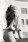
I just did my first grunge texture for a photo. I found myself fighting against letting too much grunge through the whole way (with opacities of 4% - 13%), even though I generally like the effect that others get with the addition of the textures. Did I allow enough grunginess through, or not? If you hate the grunge style, does this photo still work for you? If you like the grunge style, does my lack of the temerity to fully apply it ruin the photo for you? Original photo:  With added texture:  Jul 12 10 04:52 pm Link I have to say I do like the before more , not sure why , I guess because it looks slightly more cleaner? And she's in such a lovely pose it would be a shame to take the focus away with a heavy background. Jul 12 10 05:27 pm Link I like what the texture does to the wall, I would suggest masking it so it applies only to the wall. I'm not too crazy about the border edges. Jul 12 10 05:30 pm Link I'm not a real fan of grunge but I have done it for clients. It's important I think when applying textures that only the ones you want effect the model. Ones that darken models, make them disfigured, give contrast highlights (coz 70% of the time most are set on hard light, multiply and overlay modes) must be masked so it only touches places on the pic ye actually want and not the lot. In this case I really like the model and pose - its something I'd tackle myself however I dont like the way the texture made her dirty - know what I mean? I think it'd pop better with her clean Just my opinion I know others love grunge so they probably have contrasting ones  Jul 13 10 05:51 am Link I love the texture applied to the wall... not to the model in *this* case, because the juxtaposition seems to be more important to me in this shot, rather than by example applying to the whole image and making more of a "period" statement about the shot. Jul 13 10 05:56 am Link |