|
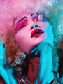
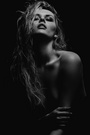
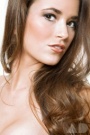
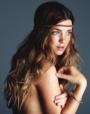
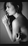
I've these 2 photos that I've taken and retouched, but I'm still not fully satisfied with them. Any ideas how to give them the extra oomph? (:   May 28 10 02:28 am Link May 28 10 02:44 am Link Cool shots  Top one I could suggest removing the flyaway's from the front of her head. Perhaps on the left of her hair, you could add more, so there were no areas you could see the floor. IMHO adding this sort of volume, plus it coming in from left may draw the viewers eye in toward the face. 2'nd image (and please mind this is just something I would do) Id remove the tattoo off the arm. The reason being that its not completely visible, therefore doesnt add to the shot. May 28 10 02:48 am Link The second one has serious skin tone and exposure issues. Skin tone is not even. There are some grays (that next to the reds look blue, as if you could see her veins) The hair is, imho, very underexposed and lacking detail. How many exposures did you make? May 28 10 02:57 am Link sorry, double post (hardware problems) May 28 10 02:57 am Link May 28 10 04:07 am Link FLEXmanta wrote: I agree there are some serious issues about the 2nd one mostly mentioned above. May 28 10 04:32 am Link to me the first one looks too flat May 28 10 07:58 am Link really like the first one, but minor stuffs like removing flyaway hairs and matching the background (small portions on the left corner still look green...probably need to be white). May 28 10 10:39 am Link Thanks for all your replies guys! Am working on them. This is my 2nd photo now:  May 28 10 11:32 am Link ^ I like the first version you posted better. It looks like you punched the contrast on her skin and part of her hair, and lowered it on the rest... and the opposite needs to happen. Also... is her hair supposed to have green and blue in it? May 31 10 12:04 am Link Zhiffy Photography wrote: Good job on pushing the fill light on the hair, and balancing of the skin tones. May 31 10 05:28 am Link On the second version you posted...there seems to be a red stripe running vertically through her hair (in the middle of the picture).. The hair here doesn't match. Also, I'd add a little more interest to the hair on the left (her right)...And fix the tones within the hair. Her hand could use some more work. The skin is looking a lot better, however I think you could do a little more D&B work to smooth it out a bit. Also, the shadows are a little chunky (mostly on the neck, but some on the face and hand). I'd remove the unnecessary shadows, or at least even out the edges into the midtones so she doesn't look too lumpy. Also, to me, the skin still looks a little too saturated and red. Maybe tone that down just a little bit? I really love the first image I agree though, i'd add some more hair to the bulk of it behind her head, to cover the patches of floor Jun 01 10 06:25 pm Link Not over expose. Whats going on with the second pictures hair? Did you cut and paste hair from a bunch of other photos or something? The colors and texture dont match and they dont even look like they were taken with the same camera! Jun 07 10 07:26 pm Link |