|
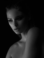
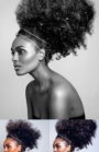
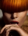
hi , i`m new on MM and i want some critique and some advice to become better at retouching ....    just few of them ... the rest are in my port thanx Mar 19 10 03:25 pm Link I think you're work is good. I'm certainly not above mistakes, nor would I criticize any one technique over another -- whatever works for you; but since you asked for advice here are some things I've noticed.  Love this image -- it's the sort of retouch that I would like to have in my port; however there seems to be a loss or discrepancy in skin texture, most noticeably between the eyes. Perhaps maybe using the patch tool to import some surrounding texture, then invert the selection and delete everything but the patch correction. That will allow you to save on RAM while you continue to work and even change the blending modes if necessary. Then you have a new layer with only the correction that you can easily mask to make the import seamless. The left side of the face (her right) and the arm seem to have noticeable lines between the shadow and midtones. If this was from curves or the burn tool, I'd use a softer brush to add shadows. If it was the result of a blur + high pass; from my experience with that technique it's usually best to mask the transitions from shadows to midtones and midtones to highlights, as well as edges of the face and body. I probably told you things you already know, but of those two images, those were the things that most strongly stood out to me. Mar 20 10 01:56 am Link hey ... thanx for advice  Mar 21 10 02:16 am Link SirbuT wrote: ok, this one is my favorite...skins look evenly nice, but like above comment, she looks kinda blocky (due to harsh transition). I also think that could look better with less contrast...her hairs, eyebrows, and her cloth look too dark and they are losing some details. Mar 21 10 07:38 pm Link I don't know what kind of "look" you're after. But I can see the "filtering" of the skin, there's no REAL texture anymore. Some of the light/shadow transitions are way too harsh. You have color banding in every single one of your images - that wouldn't make it to print. I do like the general feel tho... you create focus where needs to be and bring the images to life. Keep at it. x Mar 21 10 08:08 pm Link Natalia_Taffarel wrote: i used a little blur becouse i can't use D&B at his full potential ( i don't have a tablet ). Mar 21 10 10:37 pm Link My main critique is the transition between midtones-shadows-highlights. Visible banding. But that was already mentioned. Bluing is also an issue. Lets hope you get that tablet, soon. Other than, looks like a pretty good retouch. Keep improving!Mar 22 10 08:47 am Link Krunoslav-Stifter wrote: i didn't blur it alot .... just a little 60 % + highpass on unblured image ( unnoticeable ) Mar 22 10 10:11 am Link I have seen that problem before. On others people images and some of mine. Even if you don't actually blur it. It looks like you have. And sometimes, even with pixel-level D&B, texture looks smooth. Too smooth. I guess it all depends on the lighting, model skin texture and other factors. Whatever method you use, as long as it looks good at the end. If that was the original image, it looked smooth enough to me. A bit to smooth. 60% seems a bit high. BTW What blurring filter did you use? Mar 22 10 11:01 am Link i used portraiture by imagenomic Mar 22 10 11:33 am Link If you are going to use that filter, witch I think it's the best in the market, try these settings.  Use the "large" slider to correct blotchy skin, and then use soft mask for areas where its needed. That slider won't effect smaller imperfections, and skin texture. Also play around with, portrait size, and eyedropper tools. Additionaly, you can add sharpening on top, but don't overdo it. Screenshoot shows what I mean. Just make sure you mask it to areas that need it. After you apply the filter, off course. It's a shortcut technique, but used in right way can produce very good results. Mar 22 10 01:02 pm Link thanx .... my last work  what do you think about it? Mar 22 10 01:31 pm Link I think lips need a bit more work, and left highlight on her hair looks a bit too harsh. Did you use hard-edge brush? Color correction looks OK, for me. And this is subjective, but highlights on her chest and shoulders should be shadows, not bright highlights. It would give her more faltering dimensions. I'm sure you have seen it, but Nienna, did awesome job on that very same image. http://nienna1990.deviantart.com/art/Gr … -142843203 You just need to develop you eye, and with Wacom tablet... Keep practicing, and watch other people best work, and you will be great. Mar 22 10 02:00 pm Link thanx for advice Mar 22 10 10:34 pm Link  what do you think about this one? Mar 27 10 10:56 am Link I'm sure you spend most of your time on the face, and it shows. Looks real good. But, you have maybe neglect other parts of the image. Jaw and cheeks have nice yellow warm tone to them, but the forehead and hands especially have more of a magenta tint. Chest too. Having nice uniform tone of the image, looks nicer. Few more things. Her forehand has some loose hair, might be better if you clone that out. And her hands need a little bit more D&B or clone/heal. Whatever is your favorite method. I would go with D&B. You basically need to lower the intensity of the lines. I don't know the right expression in English, but I hope you know what I mean. Don't remove them inertly, just lover the intensity. Her lips are in need of your attention as well. Left and middle of her lower lip. Clone/heal and D&B. Top of her hair has a bit of green cast. Hue/Saturation with masking makes easy fix. Darker parts of her hair in lower section could be fixed too mach the rest. But that is subjective. Lower part of the image, is a bit too light for me. It's natural that our eyes go for the brightest parts of the image. I would tone that down a bit, to bring focus on the the face area. It looks like a long list, but it just small things. And you always want to be the best you can be. Proven formula to get noticed, and to move up the ladder in this industry. Keep it up. Mar 27 10 12:15 pm Link can you give me feedback to this photos?  rollover: http://sirbut.deviantart.com/art/Jay-P- … -161477896  rollover: http://sirbut.deviantart.com/art/Jay-P- … -161384005  rollover: http://sirbut.deviantart.com/art/Anton- … -161562697 Apr 22 10 01:40 am Link I was just having a wee gander (look) there through yer stuff. I like them overall, but I'm noticing a trend. Now let me say I be no expert at all and I haven't done a retouch in ages as its all illustration work currently but there's wee things your missing in each image. Lips, eyes, shadow areas needing blended, not paying attention to zee details. Its just small things in each one that if were fixed they'd be perfect. I'll do the last 3 SirbuT wrote: lip on bottom left, right of nose theres like a pimple or something. chin point and below ear have a strange grey area possibly from selection mask? eyes need more work to blend the skin in better, chin blending Apr 22 10 02:39 am Link SirbuT wrote: i might be crazy but if you look right about where the skin stops and the hair starts, the hair in the one spot kinda looks like a eye is peaking through. Apr 22 10 12:33 pm Link SirbuT wrote: Natalia uses a mouse for all her d&b, and the retouches in my portfolio with the black borders were done with a mouse. It's really just a matter of preference, and it probably wouldn't hurt to learn both. Apr 22 10 04:21 pm Link SirbuT wrote: You are improving, and it shows. But for this type of close-ups every detail counts. Apr 22 10 05:08 pm Link MP Retouch wrote: Me too! Goes even happier and dances. :oxoxo Apr 23 10 02:40 am Link CC retouch: that was an old retouch ( i don't like how i retouched it) anyway thanks to all for feedback it helped me . i hope that next time i won't make the same mistakes. on the last retouches i did't use blur and i tried to keep them natural thanx Apr 23 10 04:24 am Link can you give me some feedback about this retouches?  rollover: http://sirbut.deviantart.com/art/Beauty … 389?q=&qo=  rollover: http://sirbut.deviantart.com/art/Karlo- … 376?q=&qo= Jun 22 10 10:57 am Link SirbuT wrote: I love this one!!