|
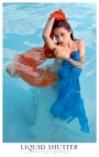
know its kinda lame to ask but how can this picture be better? i think it has some potential but now i just dont like it... thankyou,thank you thank you!!!   Jan 12 10 07:57 am Link remove all the umbrellas in the background Jan 12 10 08:01 am Link IMO, the problem is the quality light on the model. That can not be undone. Jan 12 10 08:08 am Link Tinkaa wrote: The Photoshop Junkie wrote: The shots are what they are, and I'm not sure any kind of retouching will make much of a difference. Removing the umbrellas is not a bad idea, but it's the kind of fine-tuning that does nothing to improve the fundamentals of the shots that, in my opinion, are more problematic (concept, how it's shot, wardrobe/makeup/hair, etc.). This isn't a critique forum, but you get the idea. Jan 12 10 08:11 am Link hmmm...first off, I would have posed you different. It looks like you have an amputated leg. As for the PS, I would play up the flare in a golden color. Make it more exagerated (and remove umbrellas) Jan 12 10 08:12 am Link Unfortunately, I think you should have been shot from a slightly different angle eliminating the umbrellas, lens flair and the very large area of blown out white. An ocean background including some of the buildings would have been more interesting. The white area and the color of the umbrellas are very distracting. All these things have to do with the photographer not you. I do think, though, that a warmer expression would have caught the eye of the viewer more. Jan 12 10 08:19 am Link Tinkaa wrote: The question "better for what?" comes to mind (and I don't mean that in a snarky way at all). For some uses, you could just punt and go surreal, like maybe some sort of night/day blend in this mode ... I went this route because it bleeps out most of the distracting elements -- the blown sand, lens flares, umbrellas, etc. Jan 12 10 09:56 am Link What about this?  Jan 12 10 11:29 am Link good job removing the umbrellas Dave. Jan 12 10 11:36 am Link Koray wrote: Thanks! Jan 12 10 11:50 am Link  Jan 12 10 11:58 am Link not sure how the color is, I am on a laptop in a car (talk about bad glare  ) ) But I would go more for 60's mood like this.  and I would clean some of the stuff off you leg as well. Trackpads are not great at that. Stephen Eastwood http://www.NYPhotographics.com Jan 12 10 12:12 pm Link I'd blow out the background with some bokeh as well.... Jan 12 10 03:38 pm Link  Jan 12 10 04:16 pm Link cool Mar 02 10 08:06 am Link StephenEastwood wrote: leave it to Eastwood to show everyone up while driving with a laptop...LMAO Mar 02 10 08:09 am Link FlirtynFun Photography wrote: Oh, just great. Now we are going to have photographers and models editing photos on their laptops as they drive. And they were complaining about texting while you drive. Mar 02 10 08:15 am Link The main problem with the OP's original photo is that the model is not properly in focus. The second has to do with lighting issues (lens flare is acceptable only in a narrow spectrum of shots). Because the lighting was not properly controlled, there are aspects that are burnt and blow-out. It is far easier to control lighting on the front end, than to edit out the effects of improperly controlled physics. Eastwood's reprisal of it is exceptional. Mar 02 10 08:26 am Link  or  Mar 03 10 08:09 am Link  Mar 03 10 01:56 pm Link Richard Dubois wrote: Tinkaa wrote: The shots are what they are, and I'm not sure any kind of retouching will make much of a difference. Removing the umbrellas is not a bad idea, but it's the kind of fine-tuning that does nothing to improve the fundamentals of the shots that, in my opinion, are more problematic (concept, how it's shot, wardrobe/makeup/hair, etc.). This isn't a critique forum, but you get the idea. Nothing wrong with the concept, its poorly light to the point where saving it will require sourcing material from other photos. Mar 04 10 01:18 pm Link StephenEastwood wrote: Oh my god!!!!! I'm just obsessed with the added rainbow effect! That's beautiful!!!! Really adds to the mood!!!! Mar 04 10 01:33 pm Link old school, is how I alway do images with blown highlights.  Mar 04 10 01:44 pm Link |


 "
"