|
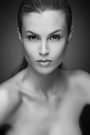
Anyone having the time to make an honest critique on a new headshot of mine? Thanks! Kels Jul 09 05 09:03 am Link It is good, I prefer the B&w the most. You have a unique but beautiful face. Use it to your advantage. You have a beautiful smile. Jul 09 05 09:26 am Link Thanks Jack! I appreciate your compliment! Kels Jul 09 05 10:12 am Link Striking for sure----I don't think it's expressive enough however. To me your strength is commercial, as you do that look very well. The kittens shot is very appealing and marketable. B Jul 09 05 10:21 am Link You have an absolutely beautiful natural smile. Continue using it, the other images (not smiling) are lacking life. You look bored, for that matter maybe you were during the shoot. A variety of looks would be good, continue working towards that, but don't stop smiling, that is what will pay the bills and get you work. Rich Jul 09 05 09:49 pm Link Jul 09 05 09:50 pm Link beautiful pose and model but i think the image needs to be a bit warmer, seems a little blue to me. Jul 10 05 02:33 am Link More emotion. Jul 10 05 07:43 am Link Hi Michael! Thanks for the input! I will work on it. I really need to come out west as the commercial market here is for older girls. I am at the right age for the LA market, don't ya think. Any recommendations for who I should submit to that is commercial? Thanks again, Kels Jul 10 05 04:16 pm Link Hey Rich, Thanks for the valuable input. I will keep smiling.....Alot of photogs have also told me to continue to smile...... Kels Jul 10 05 04:20 pm Link Robert, do ya also mean smile? Jul 10 05 04:22 pm Link Who is the model on the lower half of your port? I wanna work with her!! The head shot!! The color the shot the model Are all beautiful!! The mouth has gotta go it also puts a look into your eye!! Unless your walkin the runway dont use that look! Your port looks like 2 diff models one very Scared and 1 very happy!! Jul 10 05 04:35 pm Link Posted by Kels: no your pose is wonderful, but the image could be a little warmer, more gold, it looks like you are in the shade. Jul 11 05 04:48 am Link Well... you called it a headshot, yet you cropped off the top of the models head... not a practice I would recommend. The 'bright green' in this shot leads one's eye away from the subject. Too much dead space on the left of the image. Jul 11 05 10:24 am Link |